The Problem
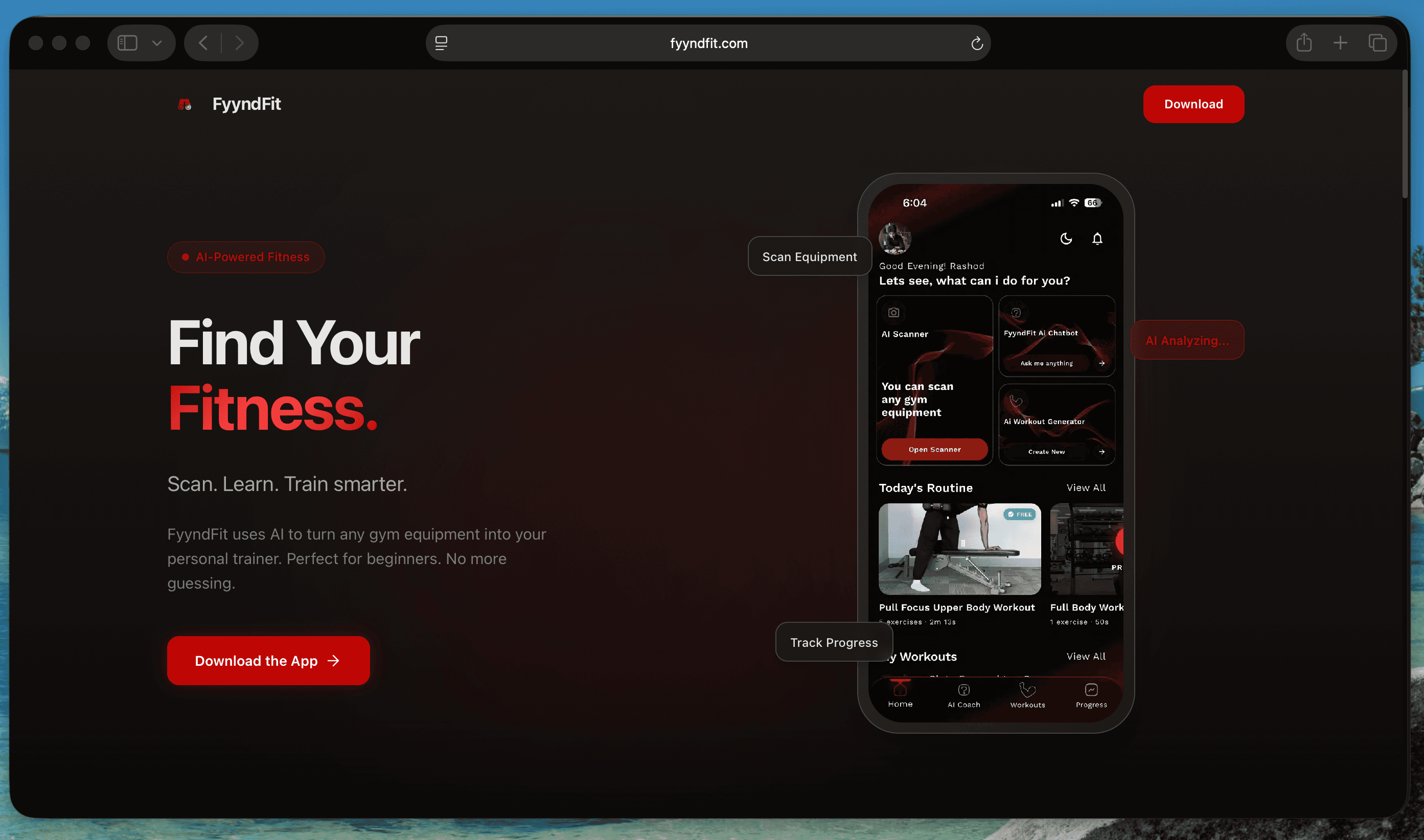
Walking into a gym for the first time is disorienting. The machines are unfamiliar, the terminology is opaque, and most fitness apps assume you already know what you are doing. Fyynd Fit was built to close that gap — a platform to guide beginners through proper form, correct machine use, and structured progression.
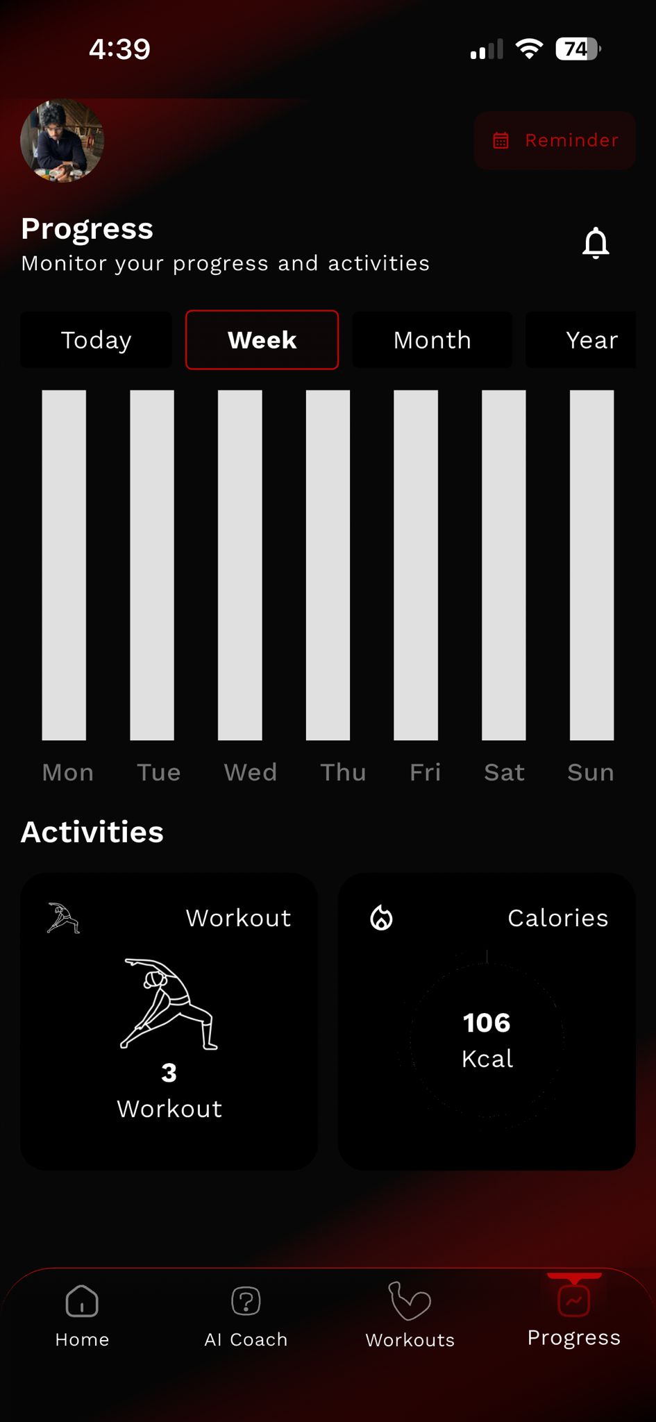
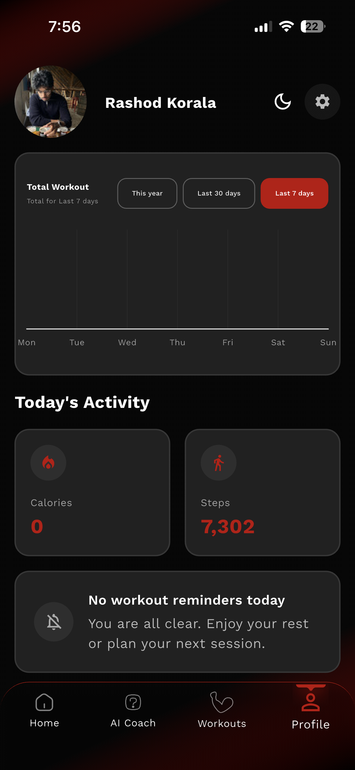
The product had the right idea. What it was missing was a way to make that progression legible. The existing progress page collected data but did not communicate it. Numbers sat in lists. Charts were either absent or visually cluttered. There was no clear hierarchy telling a user what mattered most at a glance, and no connection to the health data already living on their phone. The app was tracking a journey without giving users a map.
The Process
The work started with a research phase scoped tightly to what was actually buildable. Rather than auditing fitness apps broadly, I focused on two specific questions: what kinds of data visualisations are performant in Flutter, and what does good health data design look like across apps that get it right. Both questions had to be answered together, because a chart that works beautifully in Figma but requires a custom library to build in Flutter is a chart that does not ship on time.
I worked through graph types systematically, radial charts, stacked charts, line charts, area charts, and tested each against two criteria: does it communicate the data clearly, and can the development team implement it within the timeline. Spider web charts, which would have been a natural fit for showing training balance across cardio, strength, mobility, and weight categories, were ruled out early. They read as complex to users unfamiliar with them, and they were expensive to build correctly in Flutter. The decision to cut them was the right one, even though it meant finding another way to show the same information.
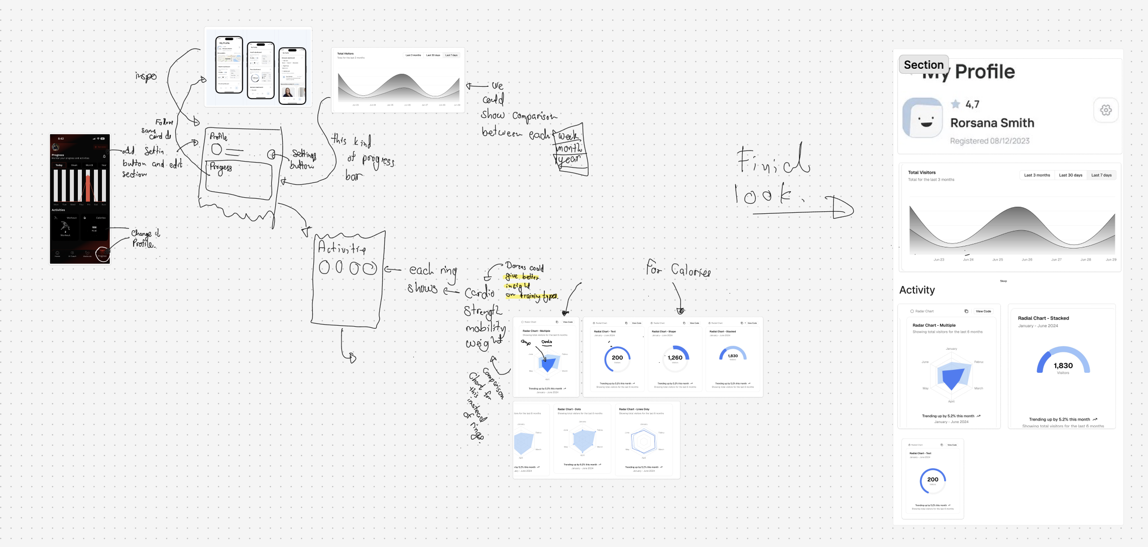
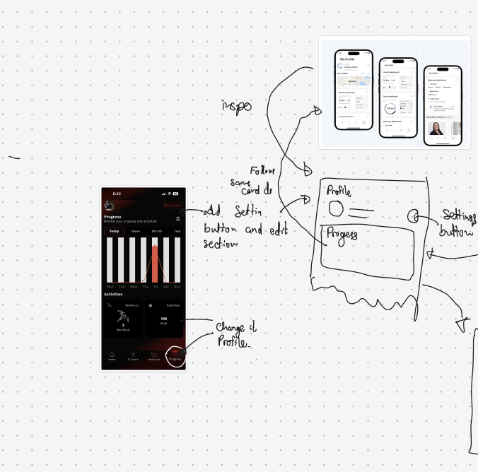
The hardest design problem was navigation and information hierarchy. A beginner user landing on their profile page should not be confronted with everything at once. The question was what earns the top of the screen, what gets shown immediately, and what lives one level deeper. Calories, steps, and overall activity trends were the highest signal data points for a beginner tracking their progress. Personal records and detailed breakdown by training type could live further down. The structure had to feel welcoming, not clinical.
I also proposed connecting the app to Apple Health and Google Health. This was the core of the profile page redesign: rather than asking users to log everything manually, the app could pull steps, calorie data, and activity history from the health platform already on their device. It lowered the friction of getting started and gave the visualisations real data to work with from day one. An Apple Watch companion app was discussed as part of this, but was correctly scoped out of the first phase to keep the launch focused.
The design process ran through Figma, with each iteration shared with the founders and development team as a working conversation. Sketches came first, rough layouts for the activity rings, the profile card structure, the graph placement. These were loose enough to invite pushback and specific enough to communicate direction. From there, the designs tightened into hi-fidelity screens that the developers could build directly from.
The Solution
The existing progress page became a profile page. The restructuring was not cosmetic. It was a reframe of what the screen was for. Progress implies looking backward. A profile implies identity and ownership. Giving users a page that felt like theirs, with their name, their registration date, their data, their trends, changed the emotional register of the feature.
The data visualisation suite was rebuilt around legibility. Radial charts for activity tracking, with each ring representing a training category: cardio, strength, mobility, weight. Stacked and line charts for calorie and visitor trends over selectable time windows, last seven days, last thirty days, last three months. Every chart type chosen because it communicated the right shape of information for that data type, and because it was implementable cleanly within Flutter's constraints.
The profile card carried the summary view: name, member since date, star rating, and the visitor trend graph directly visible without scrolling. Activity broke down beneath it with the radial charts and supporting metrics. The hierarchy was built so that a user could read the most important information in the first few seconds, then go deeper if they wanted to.
The Outcome
The app launched on 14 March, on schedule, despite a last-minute Apple App Store review delay that compressed the final days significantly. The redesigned profile and progress system shipped as a core part of that launch.
The project was a four-week sprint with a fixed deadline and a real product at the end of it. The Apple Health integration proposal was adopted, the spider web charts were cut in favour of cleaner alternatives, and the navigation structure landed close to the direction established in the early sketches.
What I Learned
Short timelines clarify thinking faster than anything else. Every decision on this project had to be justified not just by whether it was the right design choice, but by whether it was the right design choice given what could actually be built in time. That constraint turned out to be useful rather than limiting. It forced a discipline around prioritisation that longer projects can obscure. Knowing when to cut something, the Apple Watch feature, the spider charts, and being confident that the cut was the right call, is a skill that only sharpens under pressure.
Before / After
Before
After
Tools & tech stack