Overview
The new version of my personal site launched in a week. That pace was only possible because every decision from the first day pointed in the same direction, and because the system underneath was built to move fast without breaking.
The harder problem was not the build. It was that the previous site gave no real account of who I am or how I think. It showed work. It did not show a person.
The Problem
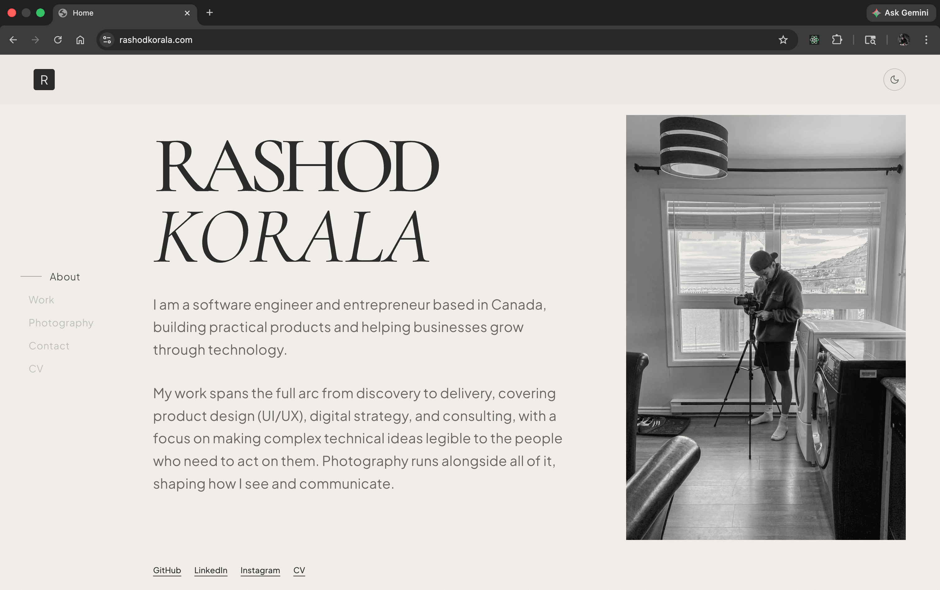
The old site used Geist Sans across the board, no type system, no hierarchy beyond basic heading levels. The layout was a single page. Everything sat at the same visual weight, which meant nothing could breathe and nothing could be emphasised. The case studies, which carry the most weight for anyone evaluating me seriously, had no room to be what they needed to be.
More than the visual issues, the site had no voice. A recruiter, a founder, or a potential client could look at it and come away with a vague impression of competence, and nothing else. That is the worst possible outcome for a portfolio. The work existed. The person behind it did not.
The Direction
Before touching any tooling, I locked in a point of view. The reference was editorial design: the pacing of a well-considered magazine layout, the authority of a type-led art catalogue. Not a product portfolio following the current conventions of heavy animation, gradient backgrounds, and glass textures. Those choices are everywhere right now, and choosing them signals nothing except familiarity with what everyone else is doing.
The aesthetic direction came from a genuine place. I practise photography, and that background shapes how I see layout problems. Rule of thirds, the golden ratio, visual weight and negative space. These are not abstract references for me but trained instincts about where the eye goes and why. Applying that thinking to screen design meant every spacing and proportion decision was grounded in something concrete, not preference.
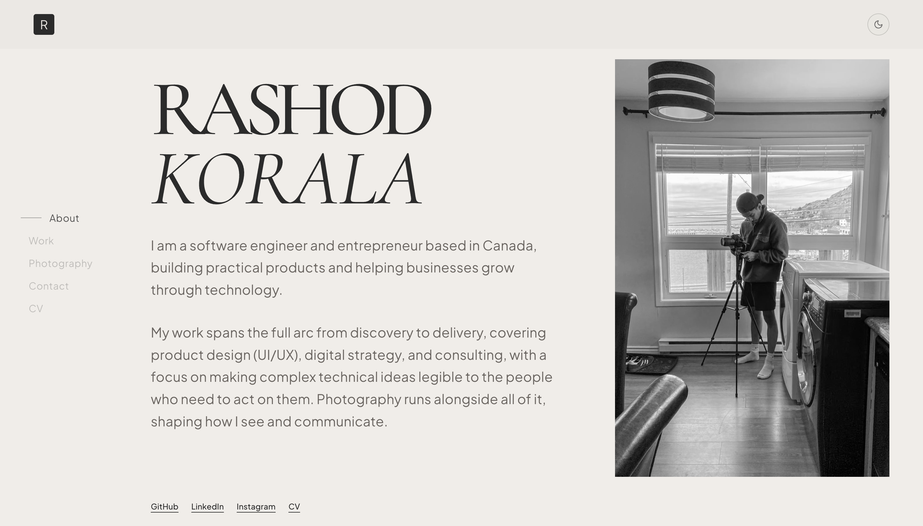
The type pairing followed from that same instinct. Cormorant Garamond at display scale for its editorial character and its relationship to classic print typography. Jakarta Sans as the counterpart: clean, legible, modern without being cold. The two work together because they occupy completely different registers. Cormorant carries weight and personality at large sizes while Jakarta handles function at smaller ones. There is no competition between them, which is exactly what a good pairing does.
Building the System
The design system is built on Fibonacci proportions. Every size in the scale, from display headings down to caption text, follows the sequence. Spacing between sections, paragraph margins, letter spacing, line heights, column widths and all of it traces back to the same set of numbers. This was not a stylistic decision but a structural one.
A system built on a single mathematical principle is easy to reason about. If a spacing value feels wrong, I know exactly where to look. If I want to shift the entire scale, I change one base value and every derived value adjusts. The site can be completely repainted, new palette, new proportion feel, different size relationships, without touching the layout logic, because the layout logic is the system and not a series of hardcoded values scattered across stylesheets.
This matters more than it might seem for a portfolio. A portfolio is never finished. Work gets added, case studies get updated, the scope of the site expands. Every time that happens on a site with hardcoded values, there is a tax: hunt down the relevant values, make sure they are consistent, hope nothing breaks elsewhere. A proper design system eliminates that tax. Making a change is cheap. Adding something new is cheap. Removing something leaves no debris.
The same thinking applied to the Supabase schema. Two tables: projects and case studies. The schema is deliberately simple. A more complex structure would have given me more flexibility in theory and more friction in practice. The site needs to be easy to update. New work goes in through the database. The frontend reads from it. Nothing needs to be redeployed for content to change.
The Structure
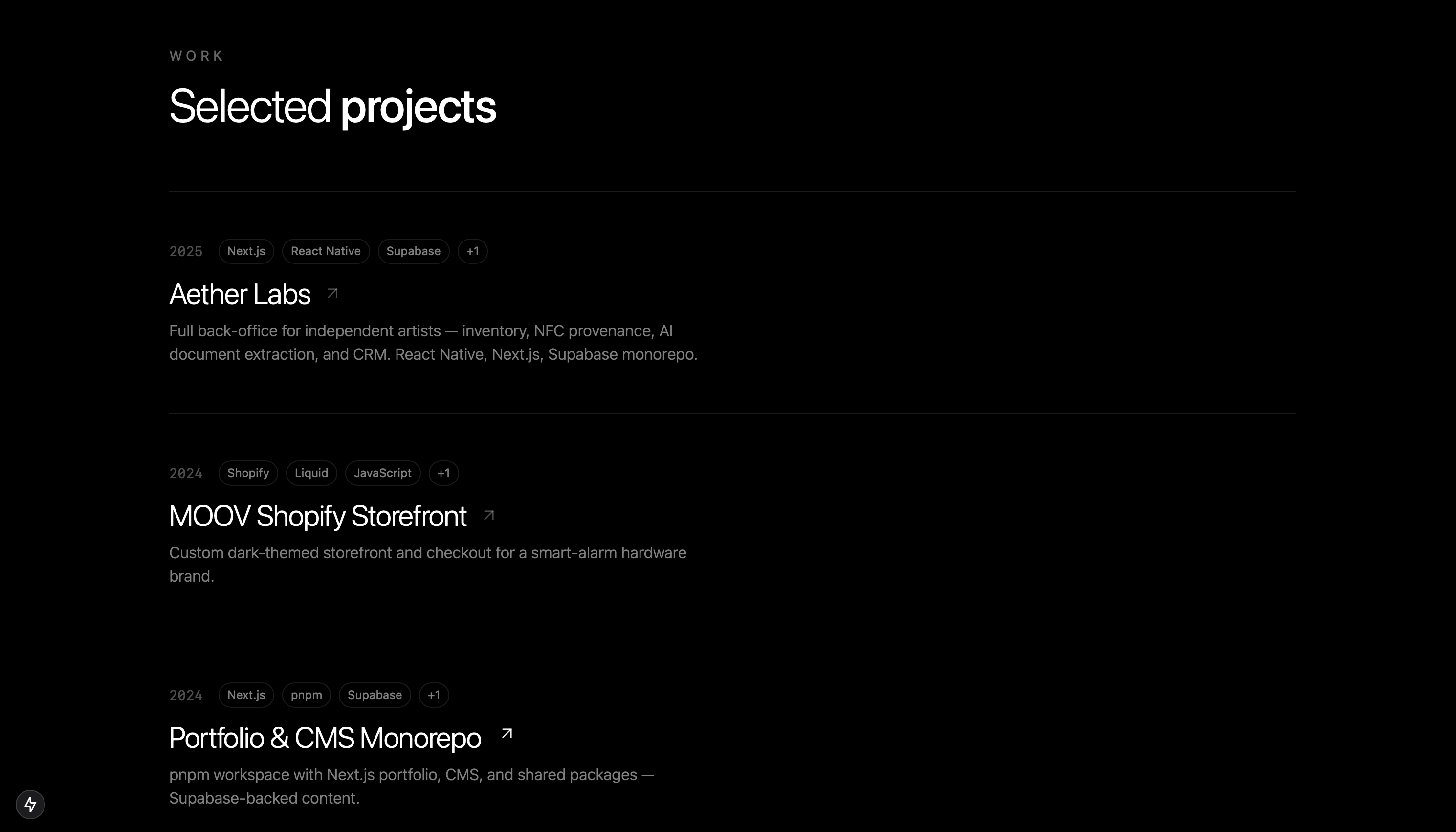
The previous site was a single page. The redesign moved to a multi-page architecture, and that decision had consequences for everything downstream.
A single page flattens hierarchy. Every project gets the same amount of space and the same visual treatment regardless of how much it deserves. The homepage becomes an index rather than an introduction. The case studies, which need room to tell full project stories, end up compressed into a format that cannot hold them.
The new structure gives the homepage one job: introduce who I am and how I think. The hero section is a statement, not a placeholder. Individual case study pages have their own space and their own pacing. A reader who cares about a specific project can go deep on it. The structure now matches the actual hierarchy of the content.
The Outcome
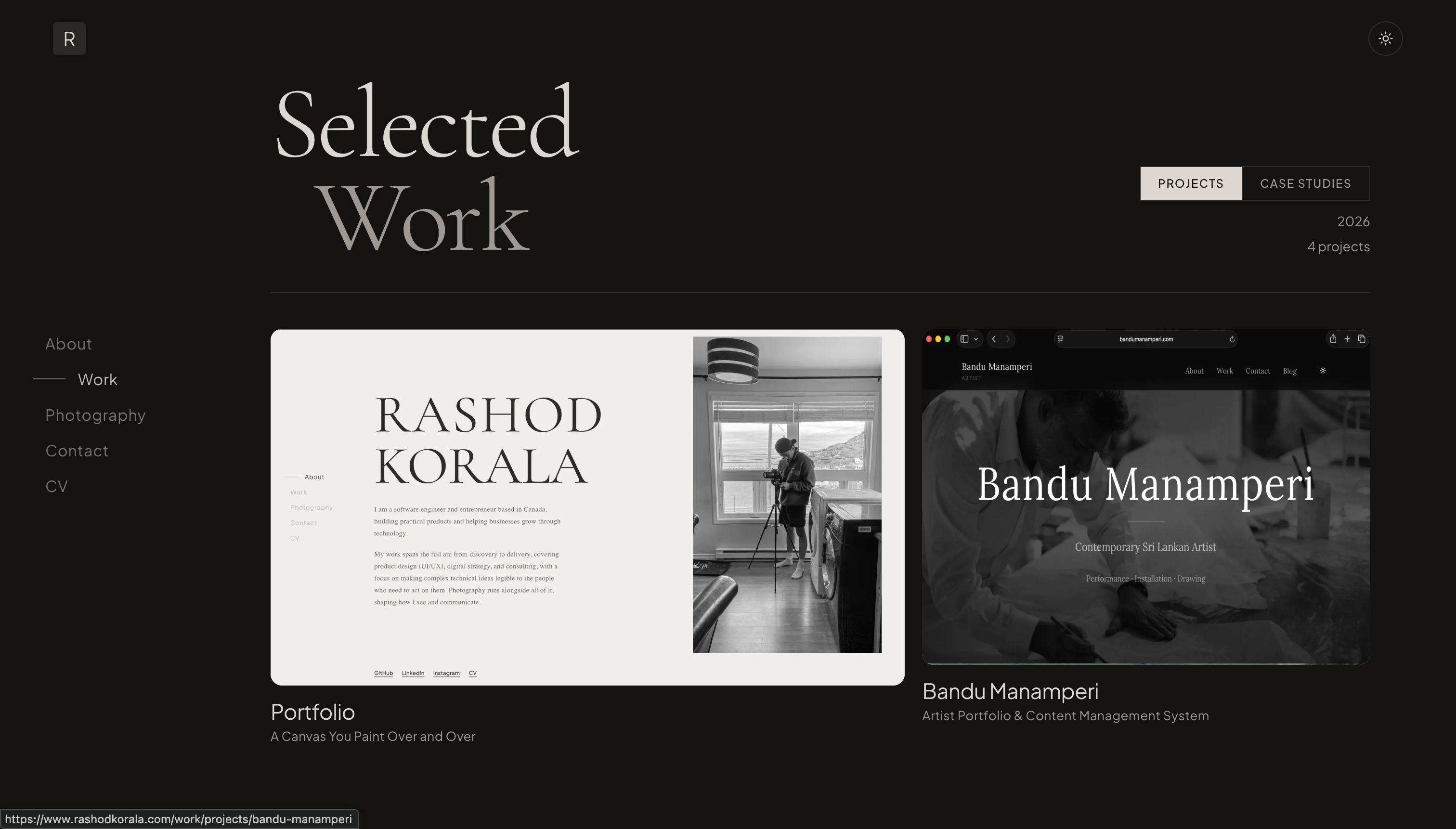
The site is live at rashodkorala.com. The design system holds together across every page. Case studies have the room they need. The type pairing does the work it was chosen to do. The Fibonacci scale is invisible to a reader, which is exactly right: a well-built system is felt, not seen.
The build took one week of focused work. That pace reflects how clearly the direction was defined before any code was written. There was no backtracking on type choices or spacing decisions mid-build, because those decisions were made in full before the build started.
The site is also genuinely easy to update. Adding a new project is a database entry. Updating a case study requires no code change. If the visual direction changes significantly in a year, the system is built to absorb that change without a full rebuild.
What I Learned
The clearest lesson from this project is that a strong opinion about what something should feel like is a technical asset, not just an aesthetic one. The Fibonacci system, the type pairing, the multi-page structure: each of these was a decision made before any code existed, and each of them made the build faster and the result more coherent. Thinking in systems from the start means the implementation almost writes itself. The photography background mattered here more than I expected, not as inspiration but as a practical skill: the same instincts that make a photograph work in a frame make a layout work on a screen. The tools are different. The thinking is the same.
Related Links
- rashodkorala.com — The live site
- Cormorant Garamond — Display typeface
- Jakarta Sans — Functional typeface
- Geist Sans — Typeface used on the previous version of the site
- Fibonacci sequence — Mathematical basis for the spacing and type scale
- Rule of thirds — Compositional principle from photography applied to layout
- Golden ratio — Proportional reference used alongside Fibonacci in layout decisions
- Supabase — Database and backend powering the site's content layer
Before / After
Before
After